Today I am launching a new series here on KKL titled Design Philosophy. It gives you an intimate look at some of my favorite designers and their design process. The inaugural post is from one of my favorite ladies; Naomi Stein of Design Manifest. I am sure you have seen her amaaaaazing loft as Naomi is taking the internet by storm. Take it away, Naomi!
Hey guys, it’s Naomi from Design Manifest. When Krista asked me to come over and talk about my home I thought it was a good chance to talk about color and pattern. I’ve been really fortunate in that my loft has gotten a lot of attention. It has been featured on Design Sponge, several international/online magazines, loads of blogs and I’m guessing it’s been pinned a time or two. Pictures are nice, but I like to delve a little further into the thought process behind the design. I wrote a bit about my furniture and theme selections over on Small Shop, but I’ve never really talked about color and pattern mixology.
So here it goes… color, pattern, and my loft.
I’m a white wall girl, through and through. Yes, the loft is a rental with soaring ceilings, so that helped cement my decision to stay white. But on top of that, I like crisp bright spaces that are speckled with color and pattern. This is what I went for in my living room: white walls, cream rug, linen sofa and a big ‘ole pillow party.
Early on, I chose pink and blue as my theme in the place and I later added black for a little drama. For my pillows I really lucked out on fabrics- both the solid velvet and flamestitch were cheap remnants scores. A stripe and a chinoiserie-themed pillow (It’s actually Goddesses) were an easy way to mix in variety. I love a toile/ scenery type fabric to mix up geometrics and other patterns! I also don’t like both sides of the sofa to match exactly. Mix in two similar pillows but change up the size or pattern, or both!
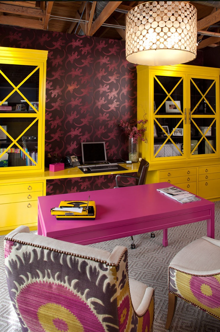
Even though I’m a self admitted white wall girl, sometimes you need a little drama. My first action step in decorating my loft was painting a dark, depressing alcove adeep blue. I loved the way my pink desk popped against it and I felt it did a good job of cementing my color theme without overwhelming the whole loft.
A small space is a great place to go bold. Just make sure to balance it out with lots of white and a little wood to maintain a natural element. My grandmother gave me this painting that just happened to feature my color scheme: pink and blue! I thought it was a great fit in my loft, but wanted to make sure I didn’t pair it directly with blue and pink elements as I don’t like my spaces too matchy.
Instead I perched my favorite bench (covered in David Hicks La Fiorentina) under it and filled it with pillows that complemented the art but didn’t feature the strong pink element. Mixing patterns here wasn’t an easy task. I didn’t want to use geometrics as I felt that would detract from the bench. I lucked out when I found silk and velvet ikat scraps. Ikats are abstract enough that they go with just about everything. When mixing, make sure you vary the size, scale and color.
I thought long and hard before wallpapering a nook in my living room. It was an odd hollow area on a brick wall and I knew I needed a statement piece there to give it a purpose. The pattern couldn’t be too crazy, though, because I really wanted to use fun pillows on the sofa. (See above.)
I opted for “the birds” or Paradiso by Nina Campbell. I felt the animal theme was organic enough to mix with other patterns and the colors were close to my pinks and blues while not being too matchy-matchy. Yea, I know I said that above- but not matching was a big focus of mine!
To balance out all of that pink and blue, I opted to leave some areas “color-less.” My dining area is basically all black and white with a pop of red in the antique suzani tablecloth.
Keeping the colors simpler allowed me to be a little bolder with my patterns. Black and white chevron is more subtle when its set against black dining chairs.I applied the same color story in my bedroom, but avoided bold, bright hues. This room is for relaxation, so I wanted the overall feel to be more calming. I didn’t hold back from using patterns though. I love the way my perky, geometric Caitlin Wilson Pillows play against my batik dyed bedspread!
And sometimes I just let the ART do the talking. I purposely asked Nicole to feature pink and blue in my painting to coordinate with my space. But I also gave it it’s own dedicated area to stand out. I painted out that black background to really help it pop. (You can learn more about it here.)
Ultimately I broke a lot of design rules when planning out my color and pattern scheme. I used a lot of colors (pink, blue, black, red.) I matched my art to my interiors. I layered patterns on top of patterns. I think that breaking the rules and following your intuition is essential to a good design.
Two rules I would stick to?
1. SCALE! Meaning your pattern repeats should be varied. Do a big pattern, a little pattern, a solid and a geometric. And they don’t all need to match. A couple can match and a third can be odd man out- it’s more interesting that way.
2. Edit your COLOR! Meaning, you may need to take some away. I love color, but often times less is more. Each time you bring in a new color element, you lessen the impact of your other elements.
Oh dear, did I get too chatty? I hope that helped you think about mixology a little. Happy Decorating!