Category Archives: Furniture

09.13.11

Society Social.

I love highlighting women who follow their dreams, and Roxy of My Cup of Te is certainly following hers.  A self-proclaimed “ex-rat racer turned dream chaser,” Roxy has recently launched her own line of furniture called Society Social.  I couldn’t be more excited over the lines and colorways that she has to offer.
Now, being the entrepreneur that she is, Roxy didn’t just create a catalog to showcase her new line, she created a Magalog, that is, part magazine, part catalog.  Genius!  Being a Marketing major, I am so in love with this idea on so many levels… she is selling a lifestyle, not just a piece of furniture.)  You can check it out here.
Cheers!

09.09.11

Fresh Perspective: Mona Ross Berman

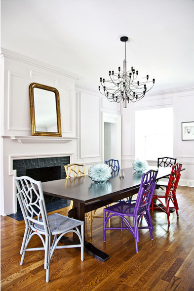
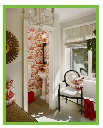
Last week while reading House Beautiful on the plane home from California, I was introduced to the work of Mona Ross Berman, she had me at hello.  What a fresh perspective on classic design.  These are pictures from a New Jersey beach house that she designed for a client.
I love the bright, cheery and causal mix of textures and colors she uses.  It’s so versatile, like the LBD that can be dressed up, or dressed down.  I think her designs would suit so many styles.
Read all about ithere.

09.06.11

Mykea.

A few weeks ago, I wrote about O’verlays.  I have recently stumbled upon another alternative to sprucing up your Ikea furniture.  They’re stickers and they’re called Mykea.  First you choose what piece of Ikea furniture that you have, then choose your pattern.  Here are examples of what you can create:

08.03.11

A Big Boy Room.

When my friend, Kristin Mika of Hampton Paper Designs asked me to help her with her son Thomas’ room in their new house, of course I jumped at the chance.  Kristin and her family had just moved to a new home, and she wanted to make sure that this was a room that eight year old Thomas could grow into.  Here are some pics of his room today.  I swear, this is bigger than my bedroom!

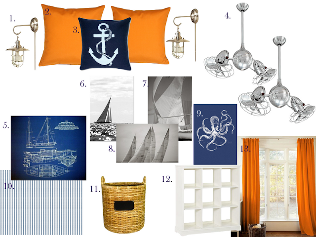
Kristin’s style is very simple, and classic-  much like her products.  So I wanted to make sure that the room would make both her and Thomas happy.  Thomas’ favorite color is orange, and we wanted to incorporate as much of the current furnishings as possible, there is currently a lot of navy– which will work perfectly with the pops of orange.  Here is the design I came up with:

1 | 2 | 3 | 4 | 5 | 6 | 7 | 8 | 9 | 10 | 11 | 12 | 13
I suggested painting the walls a crisp white and adding crown moulding, a chair rail three quarters of the way up the wall, and striped wallpaper above the chair rail.  (A great way to get the same effect, but using much less wallpaper  Although, this wallpaper is a steal!)  Because this room is so much bigger than his old room, we will need to add more furniture- perfect for toy storage.   The fans are a great alternative to Matthew’s Duplo Dinamico.  I have two of these in my family room, and I love them!
I can’t wait to see the progress Kristin makes on Thomas’ room.  I will be sure to send you the completed project.

07.12.11

Ch-Ch-Ch-Ch-Ch-Ch-Ch-Changes.

If you don’t know by now, our house is in a constant state of “progress.”  It drives my poor husband crazy.  We have made some progress on little Lou’s room.  Here are some sneak peaks of the work in progress.

When I originally had the nursery painted six years ago, I had my amazingly talented artist Corinne Marlowe paint this Lion over the changing table and a laurel wreath around her chandelier.  (More of Corinne’s work on our house to come.) As you can see the big girl bed takes up a bit more room than a crib. 

That changing table has now been converted into a dresser, and between the new bed and the shelves that we were installing, the dresser had to be moved a few inches to the left.  Here’s the problem with that: 
As much as it killed me to paint over that little lion, he had to go.  Now the question was, what to put in his place.  I knew I wanted a mirror, but couldn’t find anything that was better than what I had in my head… so I took matters into my own hands.
 I found this guy at Home Goods.  On clearance for $25.
I primed him,

Painted him,
and had a mirror cut for inside.

I should also mention that Corinne replaced the laurel wreath with stripes on the ceiling.  
 Love them.

(I was actually in her closet taking this picture… You can see the door on the side.)
The left shelving unit is lacking as you can see.  We added more drawers to the shelving units than I expected, so I am waiting on more bin pulls. I would also like to work on the styling of the lefthand shelves.
Next up:  Pillows, pictures and a new chandelier!  Stay tuned.

06.30.11

O’verlays.

I love a good Ikea hack.  And for those of you (like me) who have champagne taste and a beer budget, have I got the product for you!
They’re called O’verlays.  They are prefabricated trellis screens that perfectly compliment some of Ikea’s most popular furniture.
Just look at what they did for this $79.99 MALM dresser
And this $29.99 RAST
And my all-time favorite, a pink and orange RAST
The possibilities are endless with O’verlays.
Dress up a coffee table
or create a privacy screen.
What a fantastic, inexpensive way to dress up your furniture.  There are three different patterns to choose from.  I see some O’verlays projects in my near future.

06.15.11

Progress.

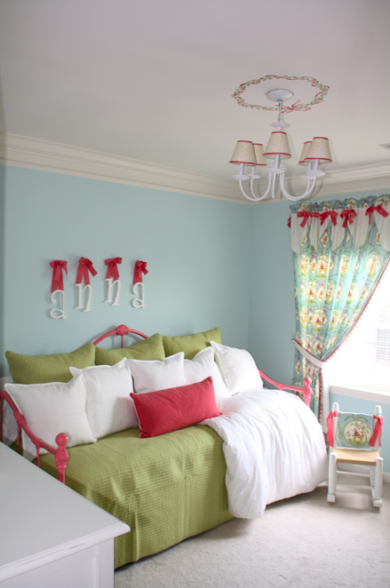
Remember this update on Lou’s big girl room?  Well, I was finally able to paint her bed.  This bed has special meaning, it was mine when I was a little girl.  I had to prime it first.  The bed was originally white, but my brother painted it black when he inherited it for his bachelor pad in Georgetown.   Gone are his bachelor days… He’s now living in the burbs with his wife, Milena and baby girl, Olivia.  They didn’t need the bed in their new house and I thought it would be so great for Lou to have it.
It took me almost an entire day to paint this baby.  Here is is (back to white) with the primer.
… And the finished product.  I used Duron’s Melon Shine.  I love the color!
I am somewhat embarrassed to show this picture as there is still so much left to do on “Project Big Girl Room.” But we’ve come a long way, baby.  Here’s a peek at what that poor little girl was sleeping on for two months until her Momma painted her bed.
So uncomfortable.  It was two mattresses stacked together.  No wonder why she wouldn’t stay in her bed!
As you can see, her room is pretty small. Here are some shots of it when we were awaiting the arrival of it’s original occupant. Perfect for a crib!
A little more crammed with a Big Girl Bed…
But we are making progress.   I just picked up the green pillows and coverlet at HomeGoods for a grand total of $80. God, I love that store.   The “Anna” letters will be 86’ed.  I’m in the process of designing her new bedskirt and a few other really exciting changes are in the works.  The bookshelves should be done this week.  I am sorry to say that most of the fabrics that I used (I originally designed the nursery 6 years ago) are now discontinued.
1 | 2 | 3 | 4 | 5 | 6 | 7 | 8 | 9 | 10 | 11 | 12 | 13
Stay tuned.. This one’s gonna be GOOD.