Category Archives: Kids

08.17.11

A New Light.

Remember this post about the chandelier in Lou’s room? Well, it’s coming along.
However, it is taking a lot more time and parts than expected…. Beleive it or not, this is 2,200 beads.
So…. we had to order more beads. After they are painted and strung, this baby will be coming home to Virginia.

08.15.11

How to Line an Envelope.

After a post on Anna’s inviations, many of you asked about how to create envelope liners.  My apologies, I promised to give you a tutorial over two months ago.  So, here it is… better late than never!
  This is one of my favorite ways to dress up a homemade invitation or note.
The first step is buying the envelope liner kit from Paper Source.
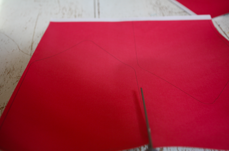
   Next choose a paper, and trace the desired envelope size, face down.  (I took these pictures one handed, while performing the demo, so they are not the best.)
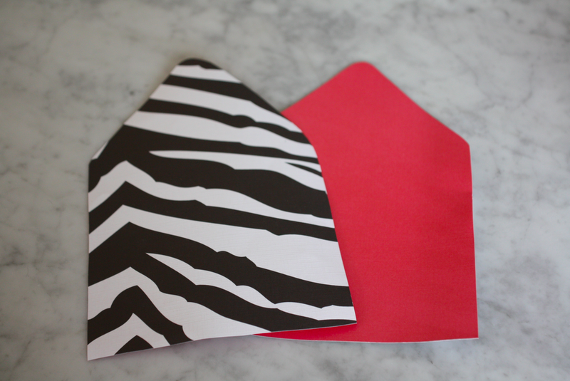
 Cut out the liners.
 Slide the liners into your envelope.
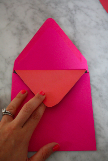
 Press down and fold to create a sharp crease.
Apply glue to top portion.
Press firmly, smooth out any bumps.
 Repeat as many times as needed.
And voila!
Now you’re ready to mail.

08.12.11

Truly Outrageous.

Does anyone remember JEM?  Well, the cartoon has made a comeback and there is no bigger fan than my E-Burger.  So, I’ll give you one guess what she chose for the theme of her next birthday party…   I love a good challenge.

08.03.11

A Big Boy Room.

When my friend, Kristin Mika of Hampton Paper Designs asked me to help her with her son Thomas’ room in their new house, of course I jumped at the chance.  Kristin and her family had just moved to a new home, and she wanted to make sure that this was a room that eight year old Thomas could grow into.  Here are some pics of his room today.  I swear, this is bigger than my bedroom!

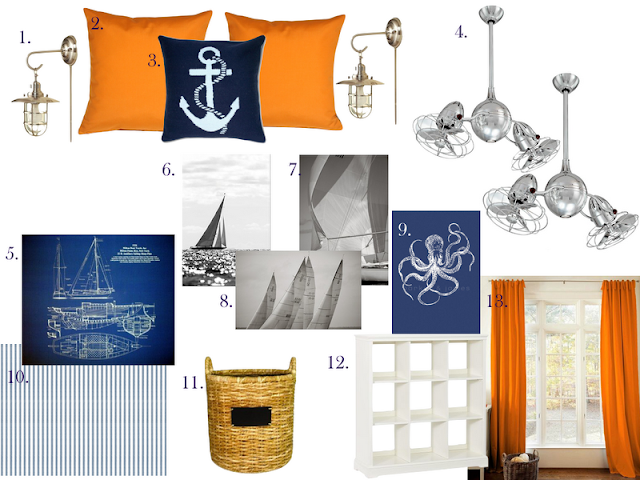
Kristin’s style is very simple, and classic-  much like her products.  So I wanted to make sure that the room would make both her and Thomas happy.  Thomas’ favorite color is orange, and we wanted to incorporate as much of the current furnishings as possible, there is currently a lot of navy– which will work perfectly with the pops of orange.  Here is the design I came up with:

1 | 2 | 3 | 4 | 5 | 6 | 7 | 8 | 9 | 10 | 11 | 12 | 13
I suggested painting the walls a crisp white and adding crown moulding, a chair rail three quarters of the way up the wall, and striped wallpaper above the chair rail.  (A great way to get the same effect, but using much less wallpaper  Although, this wallpaper is a steal!)  Because this room is so much bigger than his old room, we will need to add more furniture- perfect for toy storage.   The fans are a great alternative to Matthew’s Duplo Dinamico.  I have two of these in my family room, and I love them!
I can’t wait to see the progress Kristin makes on Thomas’ room.  I will be sure to send you the completed project.

07.05.11

A Blank Slate.

I am currently working on a kid’s playroom and found this one designed by Westbrook Interiors.  I love that the walls are covered in chalkboard paint.  It’s like a blank slate to allow creativity to thrive.
I adore everything about it.  Notice that the main color is black, but there is no lack of color.  This is a lesson I have tried to impart on many people.
 Just perfect.
Here’s my budget-friendly version:

06.24.11

ABC’s.

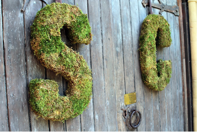
Hanging wall letters are seen in virtually every nursery out there.  There is something so exciting about boasting your child’s very existence.  I had both of my girls names on the wall in the nursery before either of them were born.  There is a fine line between stylish and gaudy when displaying your child’s name.  There are so many fonts and patterns out there that are just too “cutesy” for my taste.  
Here are some that I absolutely loved:

Moss letters.  How different!
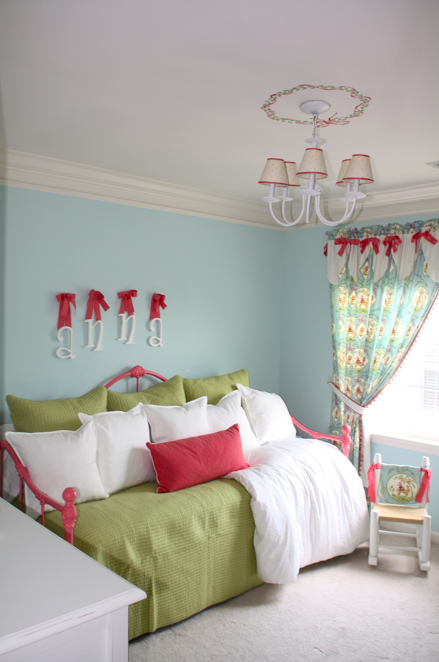
Pink and green, but not overboard.  (I would 86 the bows.)

Burlap– fantastic!
 So many things you can do with these.
 Trends are moving away from stopping at just a name.  I am working with a friend on an adorable boy’s nursery that will have these on the wall:
You can even customize your letters.
Something a little more subtle.
Which one is your favorite?

06.15.11

Progress.

Remember this update on Lou’s big girl room?  Well, I was finally able to paint her bed.  This bed has special meaning, it was mine when I was a little girl.  I had to prime it first.  The bed was originally white, but my brother painted it black when he inherited it for his bachelor pad in Georgetown.   Gone are his bachelor days… He’s now living in the burbs with his wife, Milena and baby girl, Olivia.  They didn’t need the bed in their new house and I thought it would be so great for Lou to have it.
It took me almost an entire day to paint this baby.  Here is is (back to white) with the primer.
… And the finished product.  I used Duron’s Melon Shine.  I love the color!
I am somewhat embarrassed to show this picture as there is still so much left to do on “Project Big Girl Room.” But we’ve come a long way, baby.  Here’s a peek at what that poor little girl was sleeping on for two months until her Momma painted her bed.
So uncomfortable.  It was two mattresses stacked together.  No wonder why she wouldn’t stay in her bed!
As you can see, her room is pretty small. Here are some shots of it when we were awaiting the arrival of it’s original occupant. Perfect for a crib!
A little more crammed with a Big Girl Bed…
But we are making progress.   I just picked up the green pillows and coverlet at HomeGoods for a grand total of $80. God, I love that store.   The “Anna” letters will be 86’ed.  I’m in the process of designing her new bedskirt and a few other really exciting changes are in the works.  The bookshelves should be done this week.  I am sorry to say that most of the fabrics that I used (I originally designed the nursery 6 years ago) are now discontinued.
1 | 2 | 3 | 4 | 5 | 6 | 7 | 8 | 9 | 10 | 11 | 12 | 13
Stay tuned.. This one’s gonna be GOOD.