Category Archives: on a dime

09.29.11

Frame It: Vintage Scarves.

Domino
In sourcing pieces for my next room transformation (our guest bedroom) I have fallen in love with the idea of framing a vintage scarf over the bed.  Last night on Etsy, I bought this… Isn’t she gorgeous?

06.30.11

O’verlays.

I love a good Ikea hack.  And for those of you (like me) who have champagne taste and a beer budget, have I got the product for you!
They’re called O’verlays.  They are prefabricated trellis screens that perfectly compliment some of Ikea’s most popular furniture.
Just look at what they did for this $79.99 MALM dresser
And this $29.99 RAST
And my all-time favorite, a pink and orange RAST
The possibilities are endless with O’verlays.
Dress up a coffee table
or create a privacy screen.
What a fantastic, inexpensive way to dress up your furniture.  There are three different patterns to choose from.  I see some O’verlays projects in my near future.

06.21.11

My Very Own Butterfly Collection.

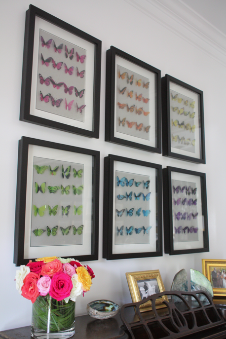
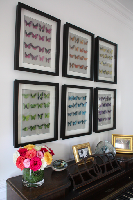
If you have been reading this blog for sometime, you are well aware of my love of butterflies.  You may also have known that I was working on a wall of butterflies for my (work in progress) living room.  Well, here they are:
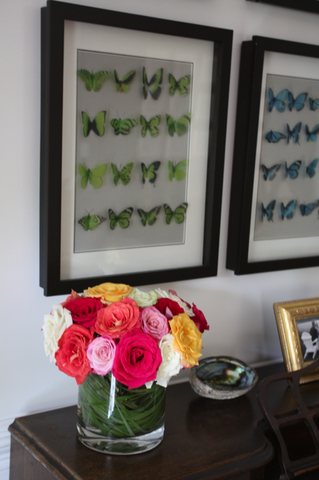
 While I wanted a wall of butterflies, the whole idea of dead specimens creeped me out.. and ….. I wouldn’t want any of these beautiful creatures killed for my benefit.  Beleive it or not, these little guys are cut out of plastic.
After a long deliberation, I decided to arrange them by color.
I inherited this piano from my parents, and they inherited from my grandmother.  I took lessons on it as a little girl, and soon, E will be too.  We plan to move the piano on the wall to the left, and put these two chairs under the butterflies once they are reupolstered in turquoise linen.
They were so easy to put together… Here’s all it took:
6 of these cases from Michaels (I got them 50% off.)  They have a great grey linen backing.
16 Butterflies in each color.
And last but certainly not least, my trusty glue gun.
Because the cases are an irregular size I had to get custom mats.  I love the way the black inner mat finishes everything off.
And I also love that I now have my own collection of butterflies, and that not one single butterfly was harmed in the process.

06.15.11

Progress.

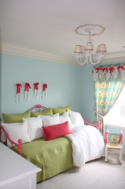
Remember this update on Lou’s big girl room?  Well, I was finally able to paint her bed.  This bed has special meaning, it was mine when I was a little girl.  I had to prime it first.  The bed was originally white, but my brother painted it black when he inherited it for his bachelor pad in Georgetown.   Gone are his bachelor days… He’s now living in the burbs with his wife, Milena and baby girl, Olivia.  They didn’t need the bed in their new house and I thought it would be so great for Lou to have it.
It took me almost an entire day to paint this baby.  Here is is (back to white) with the primer.
… And the finished product.  I used Duron’s Melon Shine.  I love the color!
I am somewhat embarrassed to show this picture as there is still so much left to do on “Project Big Girl Room.” But we’ve come a long way, baby.  Here’s a peek at what that poor little girl was sleeping on for two months until her Momma painted her bed.
So uncomfortable.  It was two mattresses stacked together.  No wonder why she wouldn’t stay in her bed!
As you can see, her room is pretty small. Here are some shots of it when we were awaiting the arrival of it’s original occupant. Perfect for a crib!
A little more crammed with a Big Girl Bed…
But we are making progress.   I just picked up the green pillows and coverlet at HomeGoods for a grand total of $80. God, I love that store.   The “Anna” letters will be 86’ed.  I’m in the process of designing her new bedskirt and a few other really exciting changes are in the works.  The bookshelves should be done this week.  I am sorry to say that most of the fabrics that I used (I originally designed the nursery 6 years ago) are now discontinued.
1 | 2 | 3 | 4 | 5 | 6 | 7 | 8 | 9 | 10 | 11 | 12 | 13
Stay tuned.. This one’s gonna be GOOD.

06.01.11

Home Decorator’s Collection.

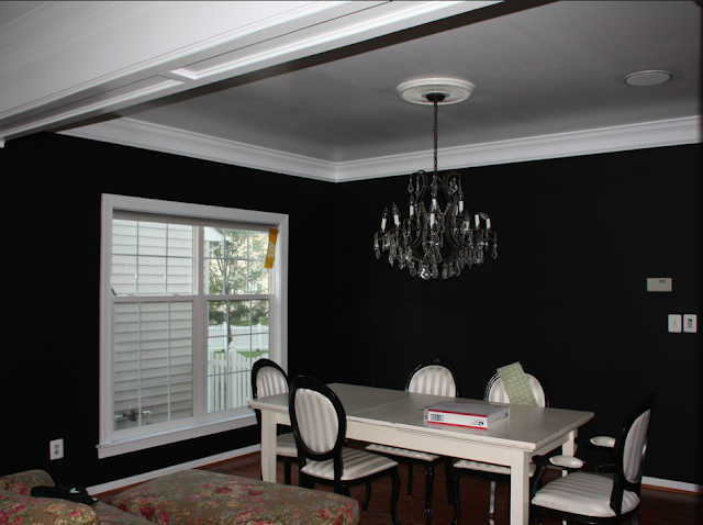
Last week I received a new catalog for Home Decorator’s Collection.  While this catalog has been around for many years, I was never incredibly impressed with their products.  The only time that I ordered from them was in 2004.  I ordered a set of Louis Chairs that I was going to have reupholstered.  Well, they sent 4 of the chairs with a white wood frame and then told me that they were out of stock and couldn’t send the other two.  Needless to say, I was furious.  So after a “talk” with management, I received the additional two chairs for free (with a dark wood frame.)  What was I going to do with 4 white chairs, and 2 mahogany?… As it turns out, I painted the frames black.  As you can see from this picture (from last year), I never replaced the fabric, and now they have been booted from the dining room to make room for my mother’s dining room chairs.
So, (as I digress) I usually don’t pay their catalog much attention, but this one made me take another looksie.  And boy, am I glad that I did!  Looks like someone’s really upped their game!
1 | 2 | 3 | 4 | 5 | 6 | 7 | 8 | 9 | 10 | 11

05.11.11

Intaglios.

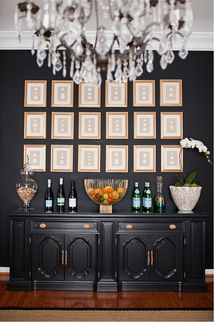
Last week I received the latest Ballard Designs Catalog and my jaw almost dropped when I saw this wall of cameos.  These little pictures are selling for $299 PER picture!  The timing couldn’t have been more perfect because I just finished a wall of 18 for under $200.  And here’s how….
I am notorious for buying items for my next big project and storing them for months if not years before I get to it.  But let’s be honest, with two kids, a full time job and this little blog– I don’t get a lot of spare time for crafting.   That being said, I bought these intaglios over a year ago for the wall in my dining room.  Well, bit by bit, I worked on this project and was able to finish just in time before Lou’s party.  Here are the results:

Here’s the cost break down:

Here’s the how-to:

18 Frames…..
I actually made mine without the glass.  The intaglios were thicker than I expected, so the frames weren’t thick enough for the glass.
 Some spray paint….
 Presto-chango:
I bought this fabric at G-Street Fabrics thinking I’d use the velvet side… but I couldn’t get rid of these darn lines…
So, I decided to use the reverse side, which I now love… it looks like linen, but it’s much more substantial.
 I traced all 18 backboards (fabric backside up) and cut them out.
I used my little craft glue gun to glue the fabric to the cardboard.  One note– make sure to pull the fabric tight to each corner and cut off the excess.  The fabric will stretch.
Then I glued on the intaglios and voila!
Now, with all of that procrastination, the hardest part was actually hanging them.  Thanks to my Pops, who painstakingly hung all 18.  Because the frames were incredibly cheap, the hooks were not evenly attached, so we used double sided velcro tape, which allows me to rearrange them as I choose.
I am so happy with the results!
 
Tutorials are not my thing– but I hope you enjoyed it… Please send me pictures if any of you decide to do your own wall of intaglios!
UPDATE:
Intaglios  |  Kiki's List
See how we updated our dining room here + here.

04.06.11

Turning A House Into A Home.

Our house is a typical builder’s grade house. When we originally moved here in 2004, we thought that we would live here a few years and eventually move “up.”  However, we love our house, we love our neighborhood and our neighbors.  One thing I didn’t love- our kitchen.  I will never forget the day of our walk-though. I walked into the kitchen and started bawling my eyes out because I hated the countertops (and really, the whole kitchen.)  My mother (God rest her soul) who was also my Realtor told me to suck it up, that we can always change the counters.   It seemed so wasteful getting rid of them because they were granite.  Albeit ugly granite, but granite nonetheless.
(Image from previous owners, 2003)

The thing that drives my husband crazy (okay, one of the things) about me is that our house is in a constant state of change.   He has come home from a business trip and I will have literally painted an entire room a different color.  I’d like to think it keeps things interesting, he would tell you differently.

Because we decided that we were going to be here for some time we (okay I) started designing to turn this house into a home.   It ended up being more “changes” than Mike signed up for.  We ended up editing a little more than just the countertops.  Most of the major was done work in November of 2009, and while it is not completely finished, I am finally willing to show you some “tweener” shots. (Thanks to Ryann Laden for the pictures)   Here are the results thus far:

Our cabinets were in perfectly good shape, I just hated the color.  So- we painted them.  We built a bulkhead to get rid of that awkward space in between the cabinets and the ceiling.  We also had extra room so we built in some shelving on the end of the island and the lower cabinets.  This has opened up our kitchen so much.  I am so in love with the boards that we had installed on the ceiling.  It wasn’t cheap, but I think it adds so much character to the space.
 Next to the sink we moved two sets of cabinets up to the ceiling and added a cafe shelf.
  We replaced all of the hardware with Gilmore knobs and pulls from Restoration Hardware.
We chose a honed Carrera, which I know is very popular, but it was just a natural fit for the space.
Ahh… My favorite part:  my new apron sink.  I like to call it my double-wide. This was something that I went back and forth on for weeks, and it actually held up the process because I decided at the last minute that I couldn’t live without it- and boy, am I that glad I did.  We had to replace the cabinet under the sink with a smaller one, and that cabinet took about 6 weeks to come in.  Then we had to have the painter come back and paint it (he had already painted the existing cabinet.)
In a few weeks my Imperial Trellis roman shades will be hung.  Again, seems quite predictable, but the color way is so perfect in my kitchen. I tried so many others and none were quite this perfect.
So there you have it- our almost-done kitchen.  I couldn’t be happier with the results and am so happy to come home to it.  The best part?  On Christmas morning last year, Mike looked around and said “Honey, I really love our kitchen. ”  RIP ugly countertops!
  Stay tuned for the exciting changes to our living room, dining room and family room!